

The Power of Design
Websites designed to ENGAGE customers with style and focus
Your website is the face of your brand and has to reflect your unique personality. We understand both design and layout of your website have a direct impact on customer perception and experience. We want them to do business with you.
Whether your website needs an entirely new design, or simply a refresh, Webdrips provides strategic, brand based designs along with streamlined development and intentional marketing to your project.
What a strategically designed website can do for your business
Our Design Approach
A design and user experience is then developed to build an online experience that's beautiful, responsive, secure, and performance-tuned.
We've developed a unique method levering an agile design workflow that helps save time and money without sacrificing quality.
How We Work
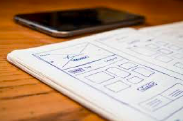
Design Process
Strategy
Design
Development
Support & Marketing
STEPS
Learn & Understand
Just tell us your vision and we will make it a reality for you. If you don't have a design in mind, one of our experienced and talented designers will create a look that is specifically tailored to your unique business style and brand.
Strategize
Our creative team will work close with you to determine the functional, technical, and business requirements of your online presences.
Establish Style Guides for consistency in Branding
Information Architecture and Site Mapping/ Wireframes
Production
Page Designs & Mockups
Review & Revisions
Development (WordPress or Drupal CMS)
Technical Considerations
Support & Marketing
We'll leave you with a well architected website, and an exceptionally simple authoring environment. Our talented designers integrate the latest design trends, usability practices, and accessibility and Search engine optimization.
Mobile Site Design & CMS Theme Designs
Make a Great First, and Lasting, Digital Impression with Mobile Ready Web Design
We understand today's websites must be user-friendly and responsive across multiple devices and browsers. A good responsive design adapts to various device screen sizes, rotation (portrait or landscape), and browser.
You might be surprised to learn that a good mobile design can not only lead to significant boost in mobile search rankings on Google, but it could even boost your desktop search rankings. We'll be sure the layout, design, and content of your website adapts well to various devices.
With over 50% of website traffic coming from mobile devices (on average), it may be crucial to make your site mobile ready.
We're happy to provide you a free consultation to determine the cost of updating your site to be modern and mobile-ready.
Drupal Themes for New Websites and Site Refreshes
There are thousands of free and cheap beautifully designed Drupal themes that will give your website instant credibility. Many of the these themes are responsive out of box, with our favorite being Drupal Bootstrap.
Whether you're starting with a napkin or a Photoshop document, or simply wish to give your site a facelift, we're happy to help. You can be sure we'll use the best-in-class and latest trends (e.g. HTML5 & CSS3) to deliver a beautiful digital experience as part of your client's customer journey. Your site will be designed with SEO and accessibility in mind where needed.
Theming is the process of applying a desired look/feel (or skin) to a website. Drupal themes can be made to run completely independently from the code that drives the functionality and business logic, and may therefore be modified or swapped with another theme without affecting overall site function.
In order to achieve the desired look/feel, we'll sit down with you and discuss all the desired layouts and what type of content lives in each region (section) of a given page. We'll be sure to cover the importance of responsive (mobile-ready) design, and how it applies to your website.
When we sit down with you, we'll cover things like if you'd prefer fluid versus fixed layout, the importance of accessibility, SEO requirements, dynamic behaviors such as drop-down menus, and the menu and navigation as a whole. Lastly, we'll cover an often overlooked element of Drupal theming (especially sites with multiple layouts): the use of tagging content to help drive layout and content automation.
Once all that's established, we'll take your Photoshop document (or napkin), then work with you to select one of the thousands of existing Drupal themes to modify. We'll show you where to look for themes and work with you to pick one that's most suited to your needs. The idea is to find something that'll require the fewest modifications and tweaks. Selecting a solid Drupal theme as a starting point saves time, even if you require a completely custom design.
Enhanced User Experience
Drupal provides over 42,000 contributed modules and counting. Nearly a third of these modules help enhance the end user experience in one way or another, including social media integration, subscriptions, voting applications, and much more. We've worked with thousands of these modules, including a majority of the popular ones, so we're able to configure and customize many of them with relative ease.
Below are just a few of the many examples where we enhanced user experiences through the use of contributed Drupal modules and/or custom code:
- Notifications/Subscriptions
- Social bookmarking
- Feeds
- Embedded media
- Polls and voting
- User forums
- Customer portals and intranets
The list goes on to include glossary of terms, FAQs, voting mechanisms, technical support forms, and so on.
Feel free to peruse our Case Studies to learn more.
Why Drupal 11?
Drupal 11 offers a beautiful new easy-to-use authoring environment that gives you far greater control over your website's layout, and advanced features to help streamline the user experience, including:
- Improved Security
- Responsive Design and Content Management
- Mobile First themes
- Improved Scalability and Performance
View our Complete Guide to Drupal 11 to learn more.
Wordpress Website Design
Quickly Create simple, beautiful and functional WordPress sites that are easy to administer. We provide an extensive list of themes, design templates and custom work in additional to all the functional plugins that your business needs.
See Our Customer Designs
Let's Get Your Project Started
Send us a message for a free website evaluation.
We're looking forward to hearing about your project.