Black Star Jewelry New eCommerce Design for Increasing Revenue through Improved Conversions

- 06 April 2021
Overview & Background
Black Star Jewelry requested Webdrips help upgrade, redesign, and optimize their website, as the site received virtually zero traffic, and therefore was not generating any revenue. The website required significant design updates, content re-structuring, and a simplified user checkout workflow in order to achieve its potential for buyer conversions, and clearly and effectively communicate the business’ story, brand position, and value to its customers. The update budget was small, so we had to do the best we could with that in mind.
To give you a quick idea of why the site was struggling, here is a before and after of the top section of the homepage:
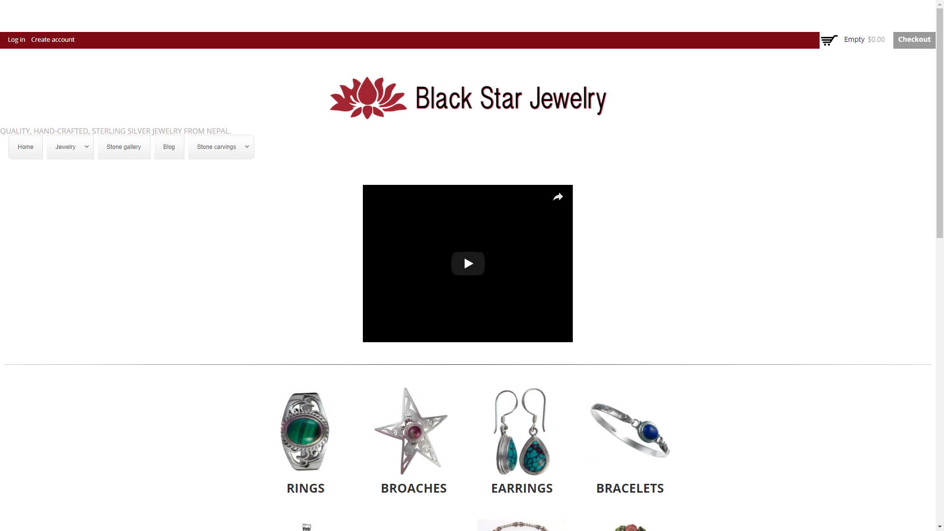
|
|
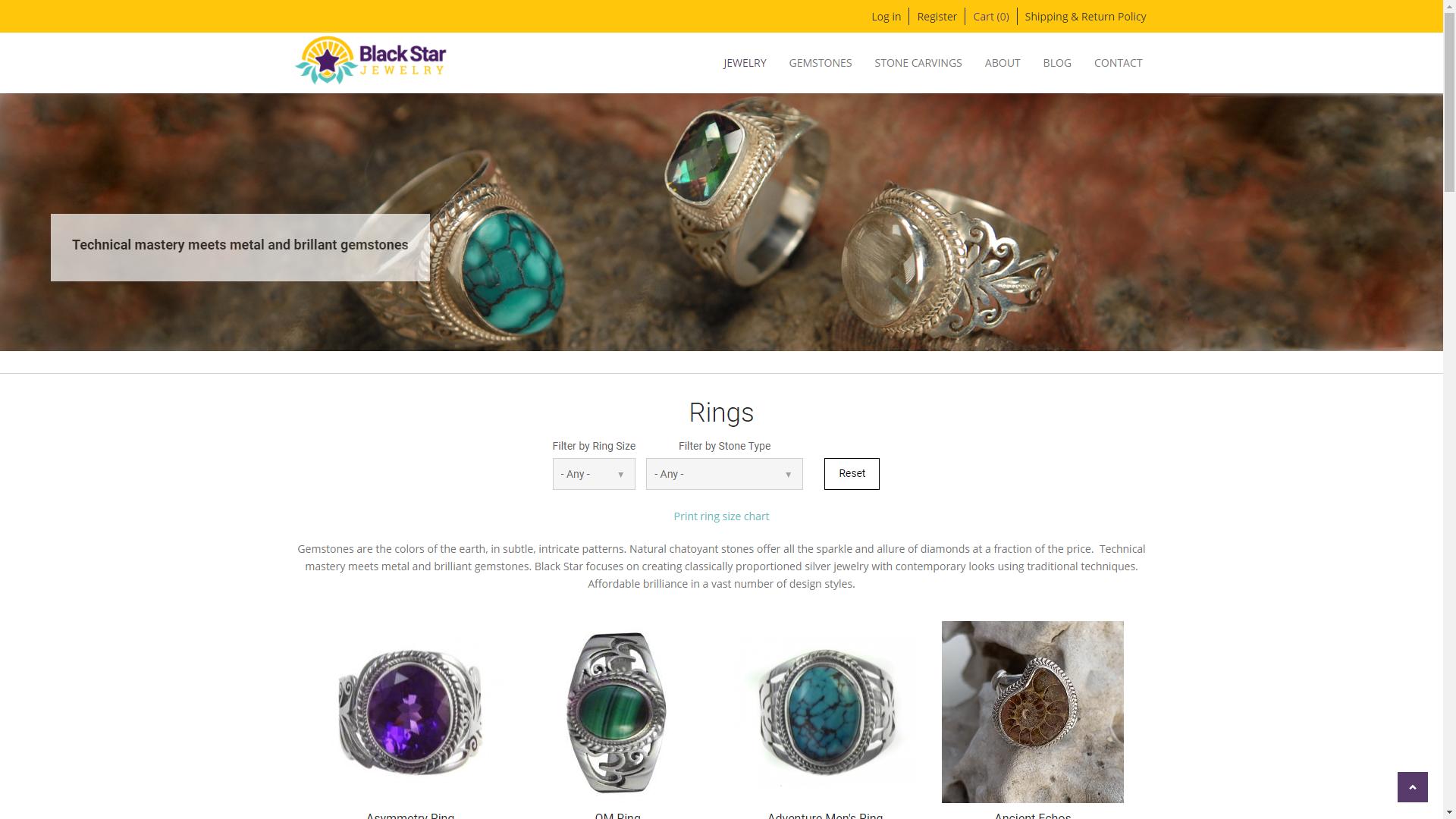
As you can see from the original design, there is a logo that occupies an entire "row" of the header, then a funky looking menu, a video with no caption or preview image, and then list or product categories. The bounce rate around 55% even with mostly direct traffic, so we knew we had to do much better.
With the updated design, we give the potential buyer an idea of what type of jewelry is being sold, an image of a person wearing multiple pieces, and a slideshow that tells a bit of the story behind the jewelry being sold.
This is one of many examples where we knew the site needed drastic changes on a relatively small budget to achieve the goals of higher conversions and a lower bounce rate.
Blackstar Jewelry supports free trade and works with many artisan families from the Himalayan mountains of Nepal. Their offerings include fine sterling silver in over 100 different stones and fossils. Each stone is individually selected and checked for color and clarity. Blackstar Jewelry is a leader in quality handcrafted jewelry with its unique yet wide selection of stones and settings.
Even on a very limited budget, we were able to achieve many of our conversion rate optimization techniques using our many years of design and UX/UI experience.
Challenges and Design Updates
The biggest challenge by far was inheriting a website that had been poorly architected. We had to make some pretty significant architecture changes to achieve the layouts and functionality desired. Unfortunately we see this far too often with Drupal commerce and other sites, which makes them difficult to maintain and upgrade. When it comes to site architecture, the less you need to achieve your design and functionality goals, the better.
For example, the shopping cart had too many steps, was confusing, didn't work on mobile, and was calculating things like taxes to be collected wrong. A bad shopping cart experience will directly correlate to a high cart abandonment rate, so we made fixing the issues with the cart and the shopping experience as a whole a top priority. With a higher budget, there are many more things that can be achieved, such as A/B testing and a continuous improvement program.
The design updates in addition to the shopping cart include the following:
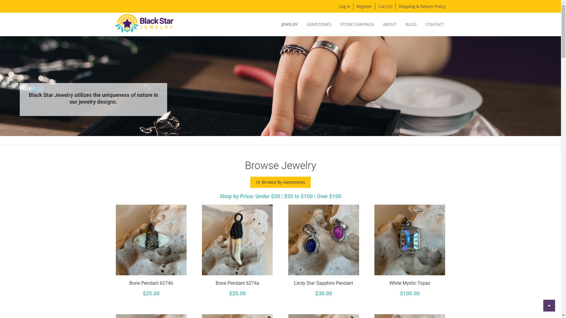
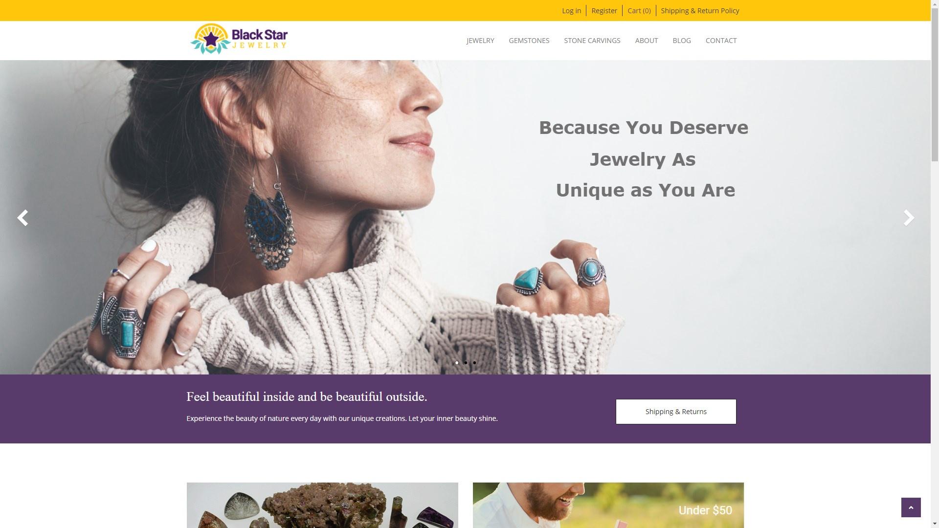
1. Homepage
The original homepage was very unclear to a potential buyer. Given that you have about eight seconds to impress a potential buyer enough to continue viewing the site, we knew a lot of changes were in order, including the following:
- Added a Shipping and return policy link to the secondary menu at the top because it is one of the first things people want to know when they are shopping online.
- Redesigned the logo and moved it to the same row as the main menu to allow us to show more above the "fold" (visible area of a page when the site first loads).
- Replaced the video with powerful images of people wearing the jewelry, and added messaging that tells the story of Black Star and a call to action.
- Added two sections to "Shop by Gemstones" and "Shop by Gifts" based on linked pricing ranges.
- Added clarity to the categories by including a title.
- Added a "how it's made" section with a call to action.
- Added a newsletter signup form.
- Replaced the footer with a more functional and easy-to-navigate one that includes useful links, categories, customer service links, and privacy and security.
Jewelry Landing Page & Category Landing Pages
As with the rest of the site, the goal of the landing pages was to improve the user experience. The old website just thrust the user into the products with no introduction, inconsistent and sometimes poor quality photos, and a poor mobile experience.
For landing pages, we added a full-screen hero image with a flexible overlay for a brief message about the page. We added a Browse by Gemstone link and price filtering links to the Jewelry landing page. For category (e.g. Rings) landing pages, we made the filtering more prominent and gave the products some "breathing room".
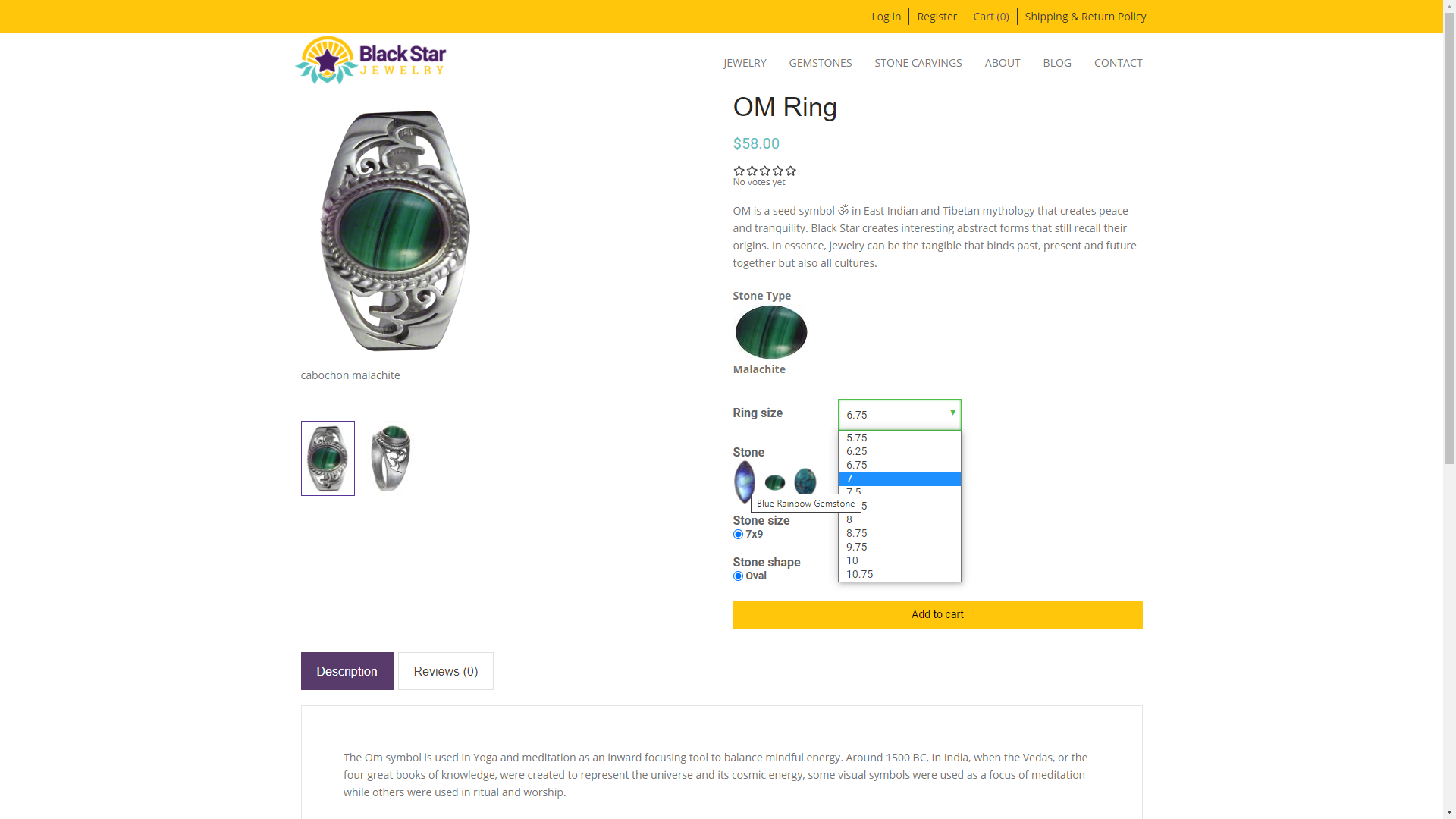
Jewelry Details Pages
One of the biggest issues on the jewelry details page was the layout was pushing the call to action below the fold, and the user was not able to see the different stones available, only the name of the stones. We changed the layout from one column to two, added an automated slideshow for each product image, added a stone type image preview with description on hover, and brought the add to cart button up to be visible above the fold.
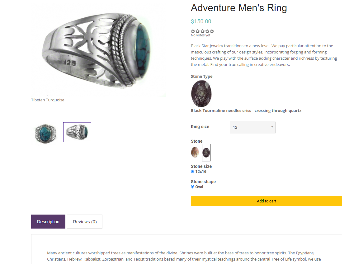
We also added a tabbed section to display a more complete description and allow customers to add reviews and rate the product. These "minor" additions can make a huge impact as potential customers like to see a product with ratings and reviews.
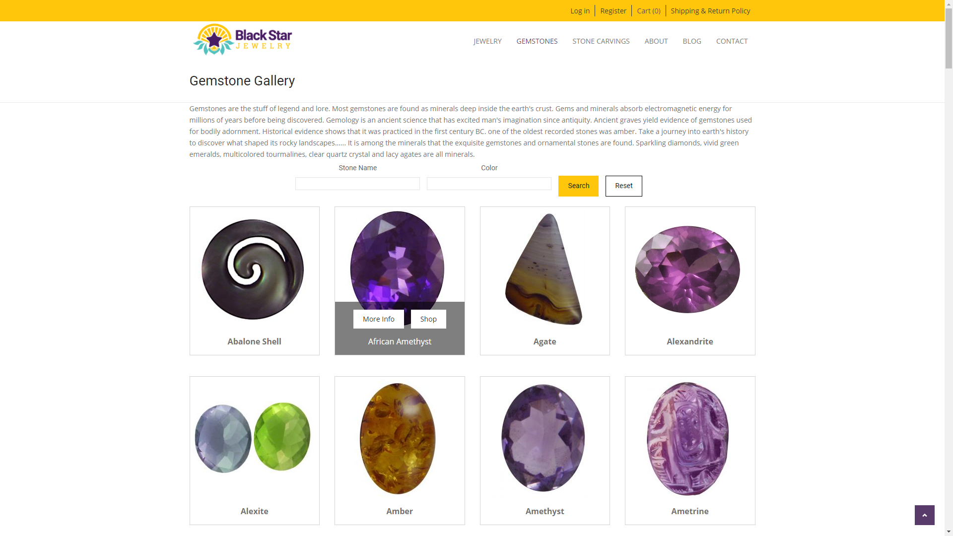
Gemstone Page
For the gemstone page, we added an introduction to the top of the page, added a search by name and color, added more breathability to the layout, and most important, added two calls to action per stone: learn more and shop by gemstone.
Conclusion
After the updated design with our content strategy was launched, we used our conversion rate optimization strategies, and the site saw a steady decline in bounce rate from 55% to 20%.
-
Skills
-
Client